
Project 5 Linocuts
Looking at my sampler again, and making a reference card:
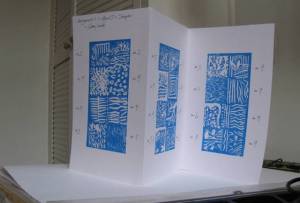
The tools I originally picked out that felt the most comfortable were no. 1 – finest v, no. 9 – deep v, and no. 3 – shallow u. At the end of the chapter, I’m generally using no. 2 rather than no. 1, and no. 3 for cleaning out the ridges on the negative bits. No. 1 is good for outlining, but cuts tend to fill up with ink unless really careful.
From the coursenotes: “how you might use the different textures and cut lines to represent your ideas. Do any immediately suggest a subject?” Coming to this question at the end of the chapter, I realise how few tools I’ve used, and how there’s a couple of textural effects on the sampler I could have used with my ‘street details’ print – but forgot about. There’s a lot of foliage potential on that sampler. Dots and circles are missing though.
Could look at Angie Lewin: http://www.angielewin.co.uk/
Project 6 Single colour linocut
I have learned:
- Choosing an image: strong tones and simple shapes, patterns, textures
- Breaking the image down appropriately (to the medium): simplify, balance, contrast. Flip it – does it work reversed?
- Draw on the lino directly, don’t copy it – need to keep it dynamic (for this sort of project)
- Pay lots of attention to edges.
I’m a bit too fond of thick black ink, and solid colour for single colour prints. I’ve been been looking at woodblock images – opaque colour and contrast – but need to avoid heaviness, and introduce some subtlety. I need to cut more finely and try more complex images. I need to look at the relationship between the paper, the image and the ink, and use more papers, particularly rougher, cheaper, recycled, coloured papers. I need to experiment more with toning down down black ink with a colour that echoes the paper (add red for creamy, blue for grey).
Things to try:
- Single colour, several passes – building up layers to add texture, tone, subtlety. Thinking about the indigo postcard.
- Adding transparency and texture to the ink and general grunginess.
- Single block but not single colour – develop this idea more. Using different colours together to liven it up a bit – see my trees, this was effective at upping the contrast for this otherwise confusing image.
- A bigger roller to make smooth gradients – maybe?
From the coursebook: “What do you have to take into account in order to create a strong single-colour design? Can you find suitable new drawing techniques which translate into a linocut that have not been included already?” The key thing is translating the image into flat, clear contrast (but not too in your face), getting the balance right, and making the most of lines, shapes and the tension between them. I’m overly focussed on simplifying it down to a state where I think I can cut it without getting in a mess.
I like the potential of linocuts for simple graphic images and I’ve been looking at Masereel woodcut prints a lot. I would like to be able to make big busy images.
I also like being able to draw directly onto the lino, and would like to be able to cut the lino as if I am drawing it – this is what I was trying to explore a bit with the 2nd version of my trees. I also want to be able to develop this bigger and more complex.
Frans Masereel: http://www.frans-masereel.de/14846_Home.html
Clifford Harper: http://agraphia.co.uk/home.html
Project 7 Multi-block linoprint
Beach debris print
Reviewing my prints – I like the shapes and the looseness, it’s impressionistic, there could be more white highlights. I like the square shape, and the potential for building patterns with repeated blocks. That’s the (only) advantage of working so small. I like it best with just 2 layers – it’s lighter with more white. Using red / orange / blue ink works and I like the printed cotton effect ( in the style of kangas/chitenjes/African cloths). I’m not sure it will do for this project as it doesn’t use perfect registration (which would detract from the effect). Anyway, I’m pleased with these. Keeping the blocks clean and flat is an issue, if it’s not flat it doesn’t print properly. I also need to cut cleaner to stop bits dropping off and the lino crumbling away – all this helps add effect to this image though (I think). I want to redo this on a bigger scale, and experiment a bit with different ways of cutting it and different colours / textures. There’s a lot that can be done on this beach theme, and I’ve got a lot of source material.
Street detail print
The important bits about this image: the background balance between warm / cool walls, strong line details of the lamp and it’s support, the wiring, guttering and downpipes, and the mysterious 2 faces which disappeared as the picture developed. I was looking at: shapes and lines, and thinking about how to get a feel for the tones and textures of the walls. Adapting the image: translating it into strong colours changed the atmosphere of the picture, and focussing in on the line details, and diminishing the blocks of wall space, changed the picture completely. This is fine! Cutting the image using softcut: I havn’t used this before, it’s a very different substance to lino. The main issues were trying not to get it too dark and heavy, dealing with the cut away areas and keeping the ink off them, and deciding whether to add colour to the lamp – my original idea was to add yellow ink to the side panels after printing, but as the picture changed, I’ve left it alone. The end result is a completely different picture, with a different atmosphere – it’s a bit more mean streets and vintage Penguin book jacket in style, crime fiction. What next? I need to try out more subtle colours and effects and see if I can get back to the original idea again. Softcut and acrylics is a good combination for experimenting I think – it’s very easy to wash the ink off and re-ink between prints, so you can work quite quickly.
From the coursebook: “During this project did you experience any problems or difficulties? Can you identify ways to solve them?”
I found the coursebook descriptions of how to translate drawings onto blocks a bit laboured – I followed the method outlined in the Susan Yeates book ‘Learning linocut’ (page 66)
My main problems were working too small, and just needing to use my tools and materials better. I’m pleased that I’ve adjusted to thinking offline, and don’t feel quite so dependent on Illustrator/Photoshop for working out my ideas. I’ve also developed a method for working that works for me, I’ve speeded up and waste less ink. This is good! Next step will be to explore textures, layers, transparency a bit more. And also building up images from separate independent blocks.
